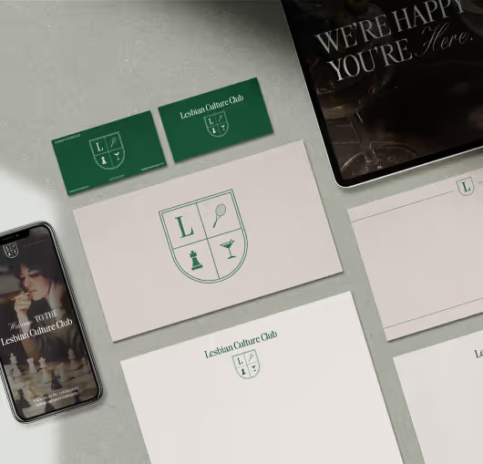
The Lesbian Culture Club emerged from a longing for dedicated spaces where queer women can gather and experience a deep sense of belonging and joy. Our friends at LCC approached us seeking a brand identity that captures the essence of their mission: to create a dynamic and inclusive space where members can celebrate their identities, support one another, and build lasting connections.

In an effort to establish the organization’s brand identity, LCC needed a logo, color palette, and typefaces that would authentically express its essence. Our goal was to create comprehensive brand guidelines that clearly defined the brand’s tone, language, and purpose. We also developed a moodboard to illustrate how these elements would be used across all brand collateral, ensuring a cohesive and consistent visual identity.


Our branding strategy for LCC began with solidifying the brand’s mission: to create an inclusive community where queer women can connect through various outlets such as sports, food and drink, creativity, and social events. During the logo ideation process, we aimed to visually represent this goal by designing a crest that symbolizes the diverse community and purpose to build a sense of belonging and connection among members while celebrating the diversity and creativity of the lesbian and queer community. We built a cohesive brand identity inspired by a vibrant yet elevated country club aesthetic, combining sophistication with a welcoming atmosphere.
To understand the unique needs and aspirations of the target audience, we began by solidifying the mission of the brand to bring its purpose to life. We crafted a brand voice that is both sophisticated and exciting, aligning with LCC’s mission to inspire and empower. Our messaging focuses on fostering community, celebrating creativity, and sharing the joy of collective experiences, ensuring a consistent and engaging presence across all touchpoints.
Next, we explored ways to visually represent who the Lesbian Culture Club is as a whole. The imagery we chose organically emerged from the diverse activities and means of connection that LCC offers. From there, we built a cohesive look and feel inspired by sport and community, creating a visual identity that reflects the vibrancy and inclusivity of LCC. By focusing on these strategic elements, we created a brand for LCC that not only stands out but also deeply connects with its community, setting the stage for long-term success and growth.

Sleek, modern design that lets LCC's branding shine.
Multiple logo marks that can be used across merch, web, and social media.
A unique and versatile typography and color guide that allows for personality and variation within the brand.
Premium brand identity designed to support unity and culture.
Sleek, modern design that lets LCC's branding shine.
Multiple logo marks that can be used across merch, web, and social media.
A unique and versatile typography and color guide that allows for personality and variation within the brand.
Premium brand identity designed to support unity and culture.